
Ever wondered how to stand out from your competitors and get more handyman jobs? Doing your job right and getting recommended by customers is one way to go about it. Another more scalable, quicker one? Building a handyman website that communicates well and lets people book you anytime.
In fact, many independent handyman and small local service businesses lose clients every day, not because they don’t offer quality work, but because their website isn’t optimized for bookings, clarity, or trust.
Whether you fix leaky faucets, assemble furniture, install shelves, handle small electrical repairs, or do general home maintenance, your ideal client is usually a busy homeowner, renter, or property manager who wants the job done fast and professionally. If your site isn’t clear, credible, and easy to book, they’ll move on to someone else.
A modern handyman web design should do more than just show your services. It should make visitors instantly understand what you offer, trust your expertise, and book an appointment in seconds. That’s exactly what the best handyman websites do.
In this guide, we’ll explore 3 real website examples, break down why they work, and show you how to apply these strategies to your own site, whether you’re a solo handyman or a small local team.
Let’s look at some of the best examples and see what makes them convert.
Built with Squarespace CMS
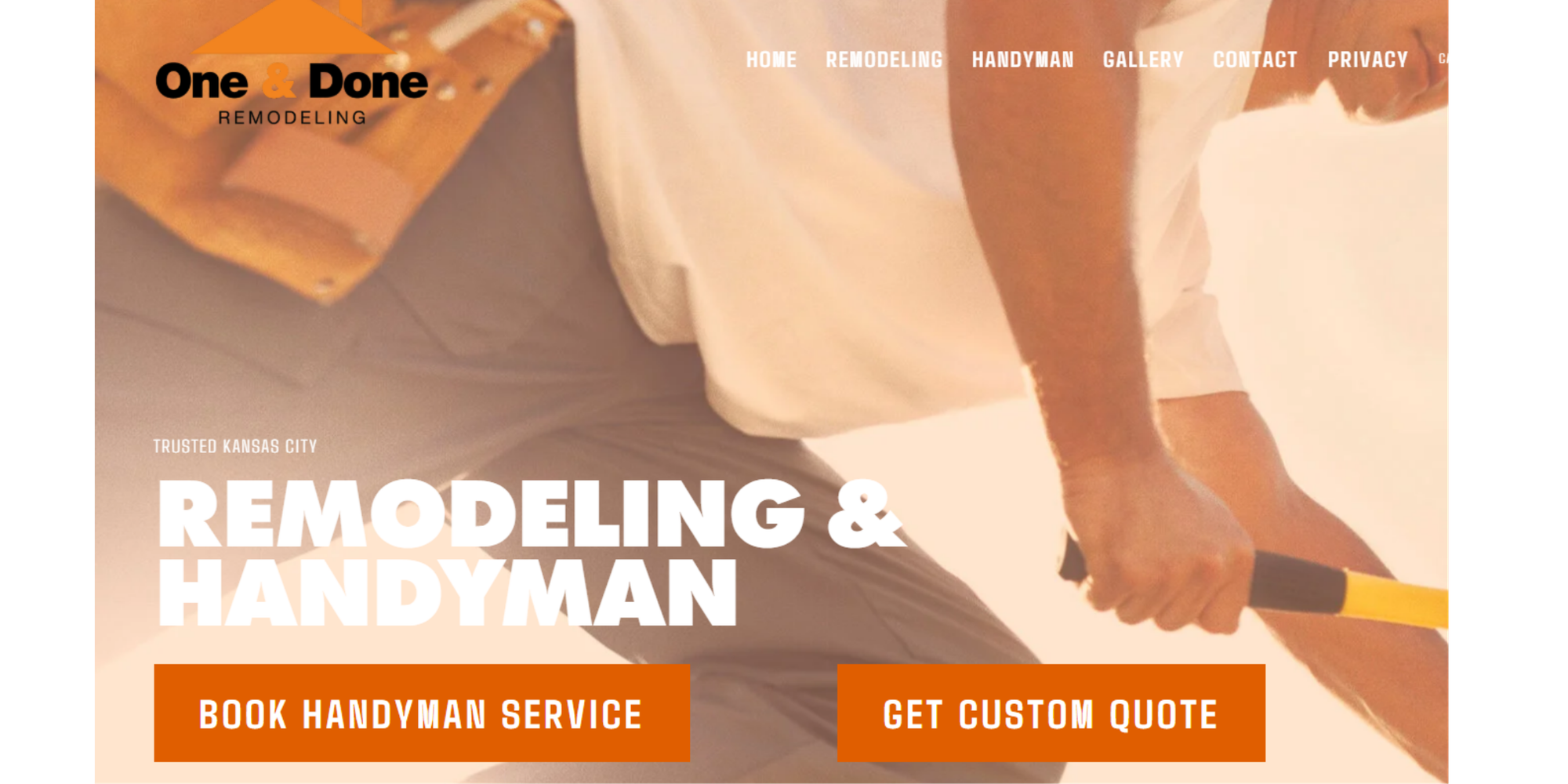
Why we love it:
- Right from the top: “trusted Kansas City – REMODELING & HANDYMAN”. It immediately states location, service scope, and credibility
- Visual simplicity: clean layout, clear typography, scroll down into sections rather than heavy clutter. It gives a professional, licensed-contractor vibe
- Credibility signals: “Licensed General Contractors”, “Accredited Business … A+ rating”. These reinforce trust.
- Testimonials are visible early: good to build social proof
Why they convert
- Clear call-to-actions (“Book Handyman Service”, “Get Custom Quote”) appear very early. They offer different forms of contact and allow immediate booking too, so the user can choose.
- Strong trust elements: licensing, accreditation, testimonials reduce friction. For someone searching for a handyman, trust is a big barrier; they reduce that barrier.
- They communicate range of services (“from changing burned out light bulbs to kitchen and bathroom remodeling”) which helps capture both small and large jobs.
- Contact info (phone) is right there. Easy to reach.
Their structure
- Hero / above the fold: The main tagline + service category + CTAs (“Book Handyman Service”, “Get Custom Quote”)
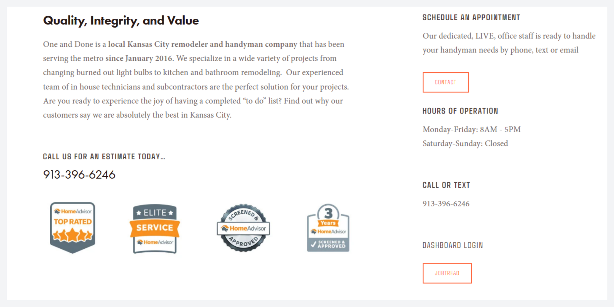
- About / value-proposition: “Quality, Integrity, and Value” + short description of the business + years of experience etc.
- Contact / CTA repetition: phone number, text, email, office hours.
- Accreditation / trust badges: licensing, BBB, HomeAdvisor etc.
- Gallery or visuals: Visual examples of the work they’ve done.
- Testimonials: quotes from customers
- Footer / details: address, service hours, link to contact/estimate
Caleb’s Handyman
Built with Wix CMS
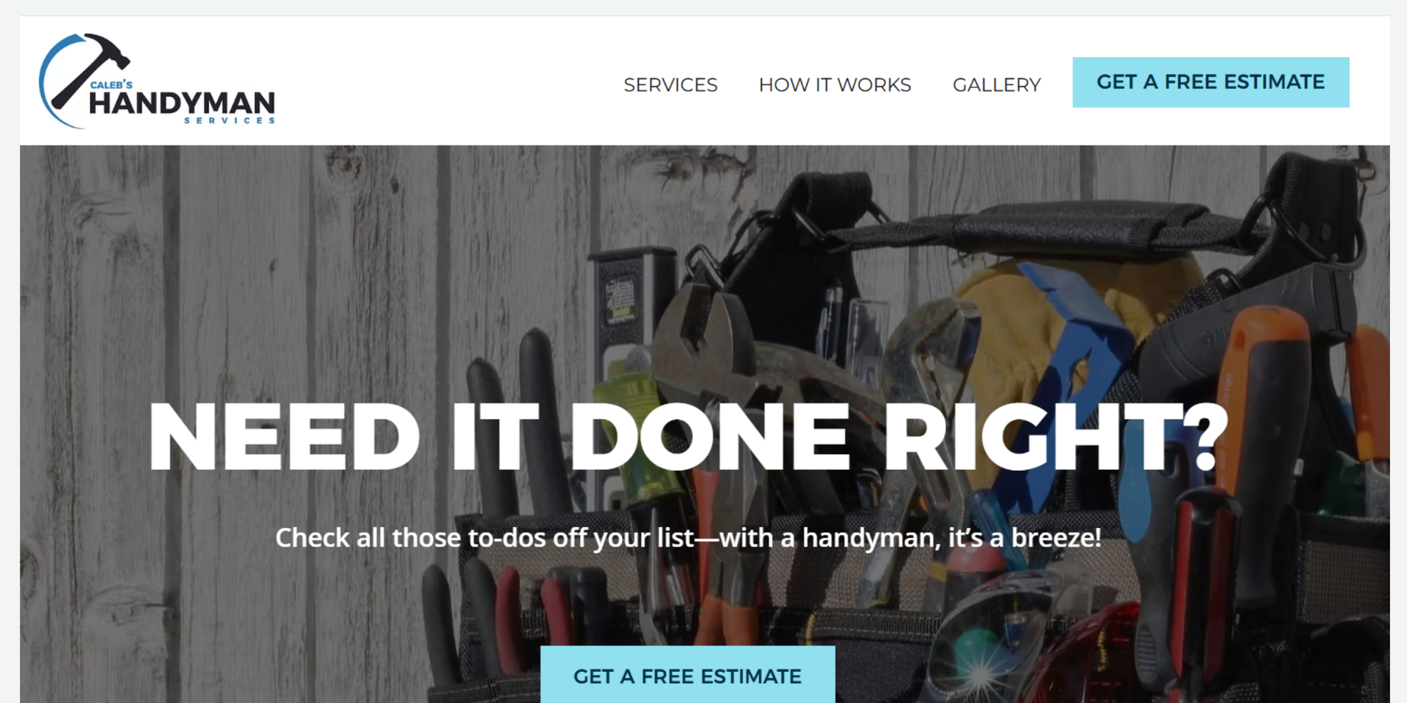
Why we love them
- Straightforward clear messaging: “Need it done right? … Check all those to-dos off your list—with a handyman, it’s a breeze!”
- Good use of visuals/icons: they list specific services (TV mounting, faucet replacement, pet door installation etc.) which helps people quickly identify “hey, that’s exactly what I need”.
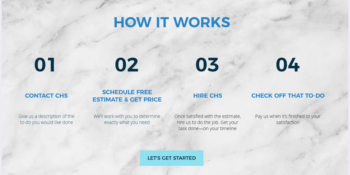
- They clearly outline the process (“How it Works” with steps: contact → schedule estimate & get price → hire → check off that to-do) which helps set expectations.
Why they convert
- The “Get a free estimate” button is repeated multiple times, making it easy to act.
- By structuring the process so clearly (“01 Contact … 02 Schedule free estimate and get price … 03 Hire us … 04 Check-off that to-do”), they reduce friction and ambiguity for a potential customer. People like clarity.
- Service list is broad but specific; the specificity builds trust (vs vague “we do everything”). When a visitor sees their exact need listed (say, “Wheelchair ramps” or “Pet door installation”) they feel: “They know what they’re doing.”
- Visual gallery of past work helps, though less visible in the markup we saw, but you can infer from “Gallery” link.
Their structure
- Top navigation: Services | How it Works | Gallery | More
- Hero section: bold headline + sub-headline + prominent CTA (“Get a Free Estimate”)
- Problem statement: they talk about the homeowner’s pain (“you may not have the time, tools, or know-how…”)
- Solution/features list: what they do (service icons)
- How it works/process section: 4 steps
- Gallery or to-do tasks checked off: showing credibility and variety
- About us/contact: small local business note, experience, contact info
- Footer: presumably with contact form, phone, email formula.
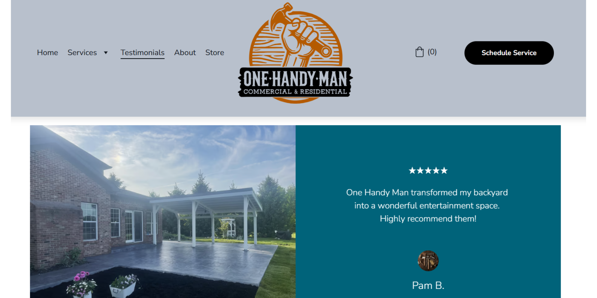
Built with Squarespace
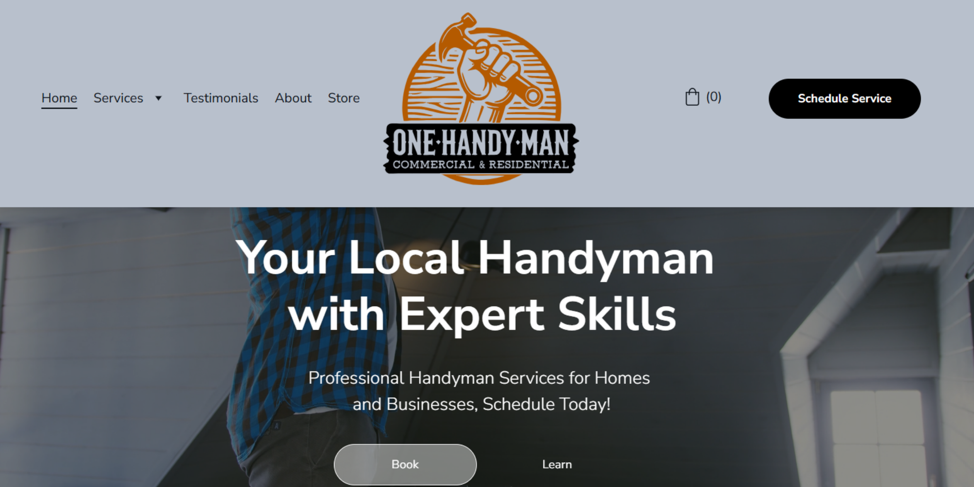
Why we love them
- Clear dual-offering: they cover residential and commercial services. This broadens their market.
- Emphasis on scheduling (“Schedule Service”) right at the top, which is good for conversion.
- Testimonials page is prominent and specific: e.g., a senior homeowner praising the work. This kind of relatable story builds trust.
- Service detail page: they list many specific tasks (faucets, painting, drywall, assembly etc) which helps draw in search/needs.
Why they convert
- The “Schedule your service now” prompt is simple and actionable.
- Broad specificity: listing many specific tasks means a visitor often sees their exact need described → “these guys can do it” → lowers friction.
- They serve both homes and business clients, implying reliability and capacity. Sometimes businesses trust service providers more (if they have commercial clients).
- They have clear contact info: phone number, email, scheduling prompt. Easy to act.
Their structure
- Top nav: Home | Services (For Home | For Business) | Testimonials | About | Store
- Hero: “Your Local Handyman with Expert Skills” + CTA (Schedule Service)
- Service overview: short introduction of what they do
- Services breakdown: sections for Residential, Commercial, plus detailed list
- Testimonials: separate page
- Contact / scheduling prompt: schedule form or at least contact data
- Footer: standard info + maybe disclaimers/store link
Tactics to make a handyman website convert better
The best handyman websites aren’t just visually nice, they are built to convert. Here are practical strategies you can implement today.
Clear “Book Now” or “Contact Us” button above the fold
When someone lands on your website, they should instantly know how to book your services or contact you.
Before you decide what your “call-to-action” button will be, you need to plan your lead strategy first. Do you want your website visitors to fill-in a form so you can follow up with a call, or would you rather they answer a few quick questions and book a meeting/service with you straight away? Each has its pros and cons. A good way to choose is to ask yourself: Does my service require a conversation first, or can someone book without any back-and-forth?
If you choose an automatic booking button with a visible “Book Now” or “Request Service” button you will:
- Reduce abandoned leads
- Create a direct conversion path
- Encourage clients to act fast instead of hesitating
Place the button:
- In the hero section
- In the site header or sticky bar
- Repeated throughout the page
A great example of this in action is how One&Done Remodelling has structured their lead flow. They offer a direct booking button for straight-forward services and a contact form for projects that require a conversation first. By placing both CTAs prominently at the center of their homepage they’ve created clear conversion paths and reduced friction for users.
Notice how the button copy itself guides the user: “Get custom quote” signals that additional details will be needed, while the booking option invites quick, effortless scheduling. This subtle distinction helps set expectations and improves overall user experience.
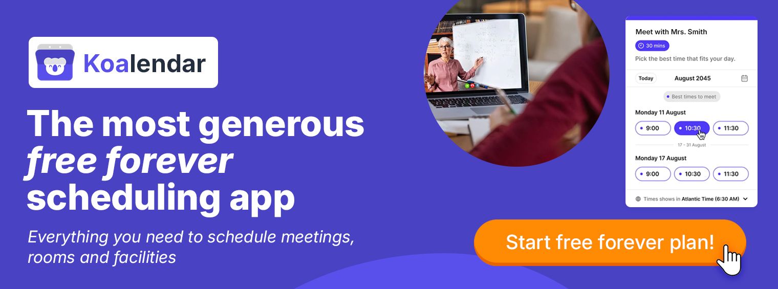
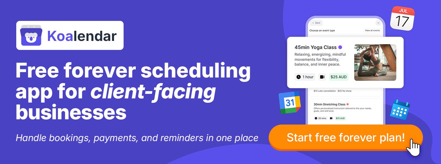
Pro tip: Use a real online booking system instead of just a contact form. With Koalendar, clients can pick a service, choose a time slot, and confirm instantly, no back-and-forth emails.
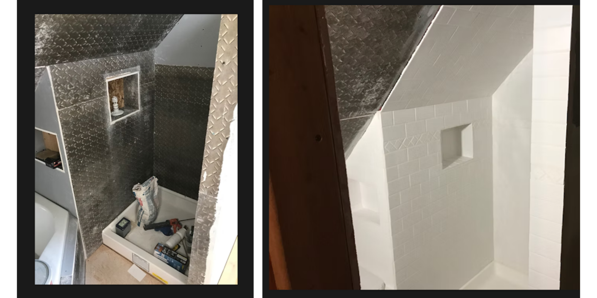
Services and photos that set expectations
People trust what they can see. High-quality photos of your work, team, and tools build credibility.
HandymanCaleb offers a gallery with before and after jobs, which helps website users get an idea of the type of jobs and quality they can expect.
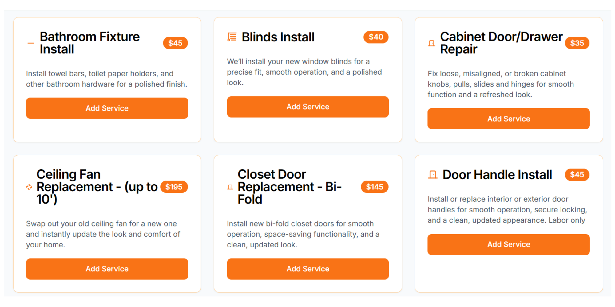
Even more important, make sure your website clearly lists services with details such as:
- Duration (e.g., “Mount a TV: 45 min”)
- Starting price (e.g., “From $75”)
- What’s included (e.g., tools, installation, cleanup)
This eliminates incomplete job info and sets expectations from the start.
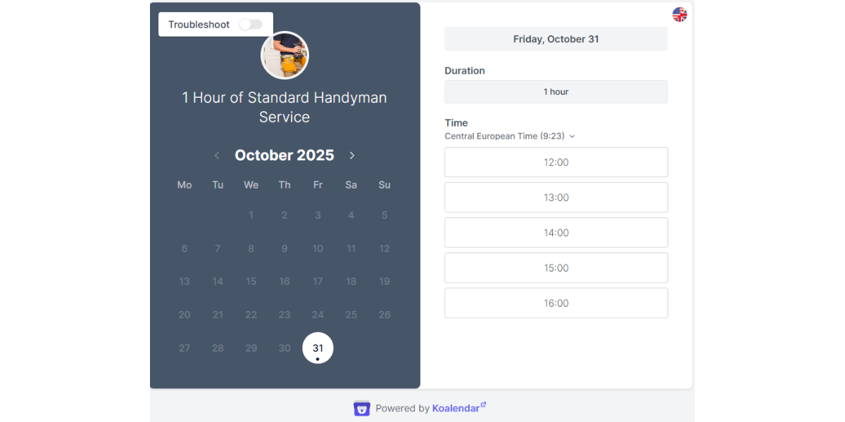
For example, Handy shows service durations and pricing right in the booking widget.
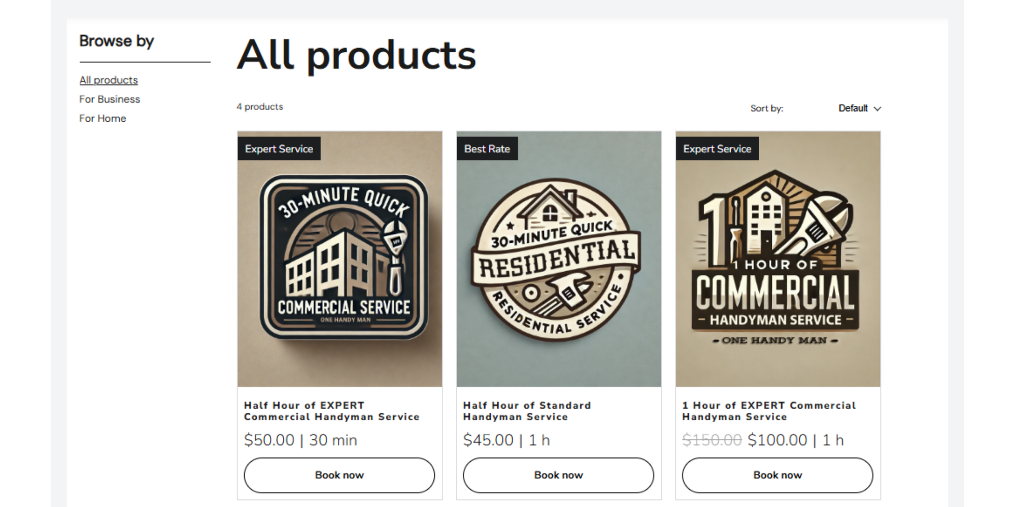
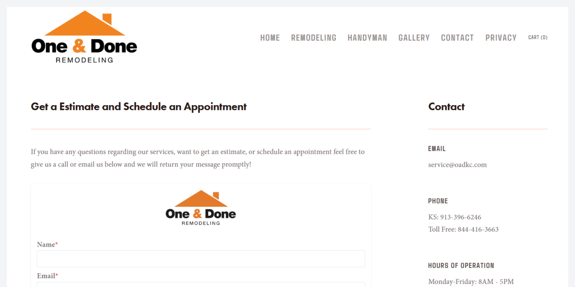
One&Done Remodeling opt for prices and a detailed description of the service
Reviews, badges, and local trust markers
For service businesses, trust is everything. You can build trust quickly by showcasing:
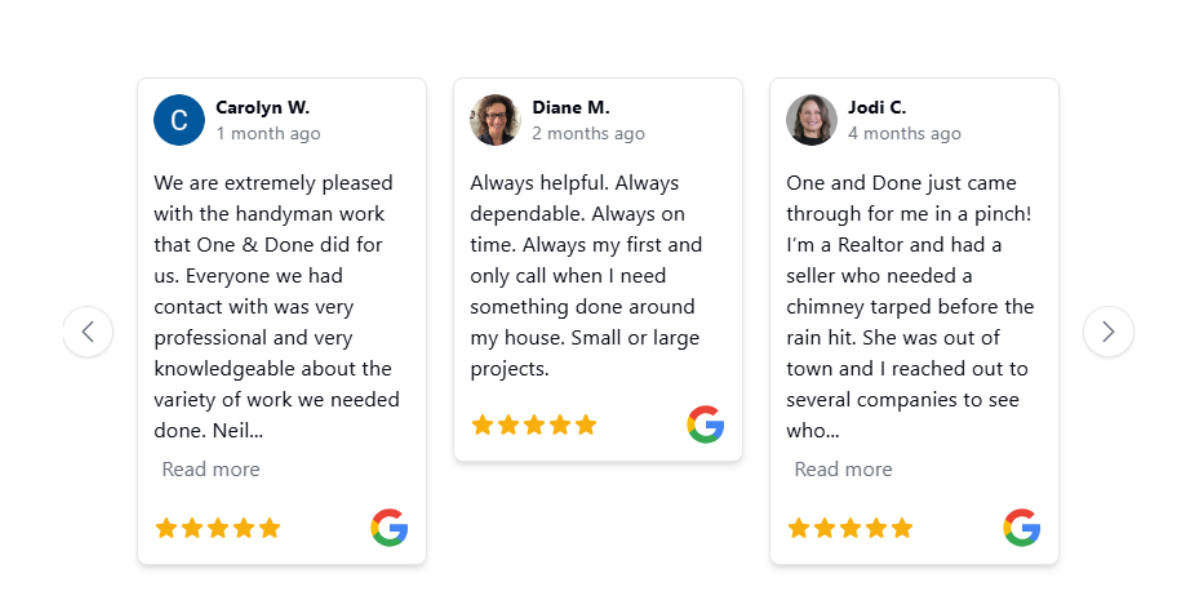
- Google reviews (embed your Google Business Profile): Examples from the One & Done Remodeling page showing Google reviews
- Certifications and licenses: One & Done Remodeling page also displays certifications and licences clearly
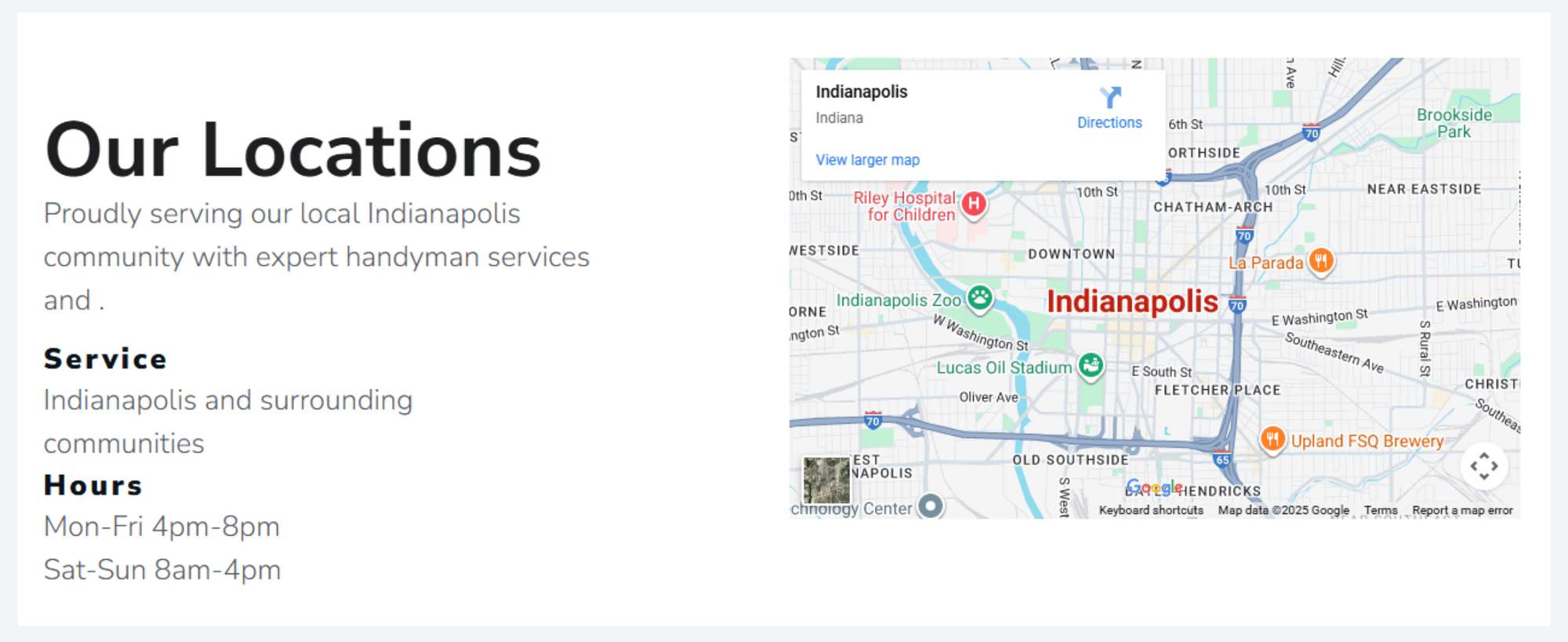
- Local service areas and neighborhoods: One Handy Service website shows the area they serve
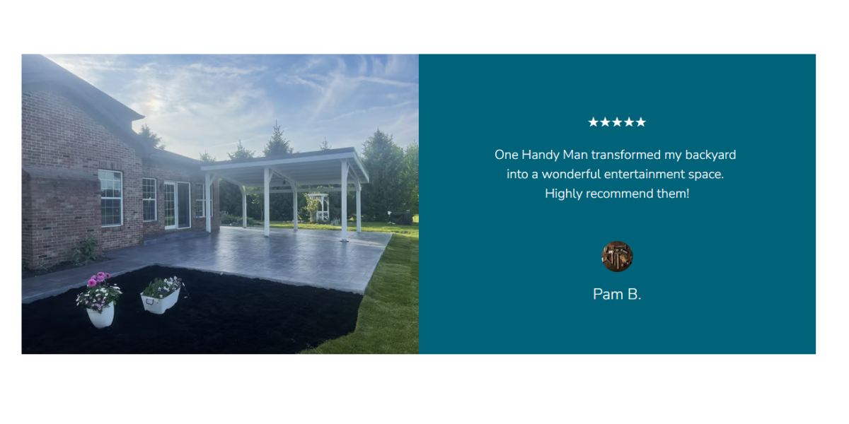
- Testimonials with names and photos: One Handy Man does this beautifully, linking images of the end result to their client's testimonies and photos.
Pro tip: Adding local SEO elements like your Google Map, service area pages, and NAP (Name, Address, Phone number) consistency helps you rank better in local searches.
Mobile-First UX
More than 60% of service bookings happen on mobile devices. If your website isn’t mobile-friendly, you’re losing leads.
A great mobile handyman website:
- Loads fast (under 3 seconds)
- Has big buttons that are easy to tap
- Uses a single-column layout for clarity
- Keeps the “Book Now” button sticky
Example: Handy offers seamless mobile booking experiences that feel like an App
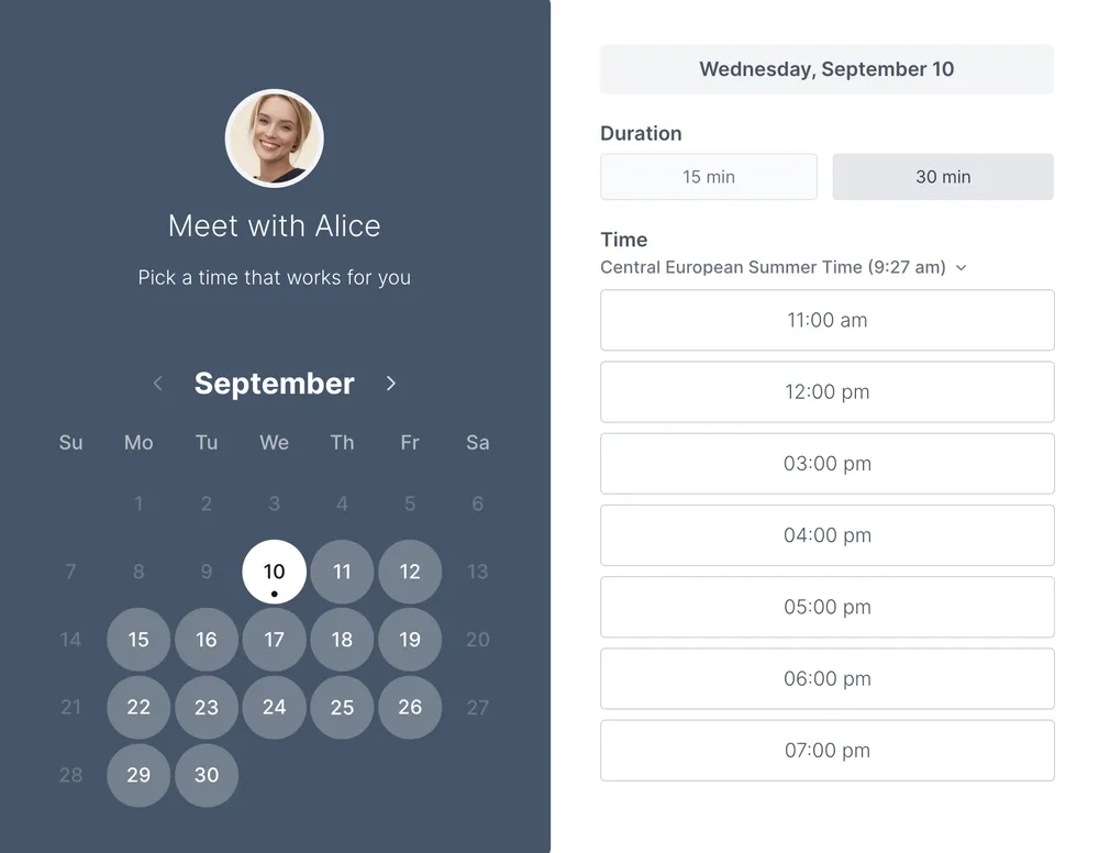
Add an online booking page to your site
Even the most beautiful website won’t convert if clients can’t book easily.
An online booking page allows:
- Clients to select a service
- Choose a time slot
- Fill in job details
- Confirm instantly (and get reminders)
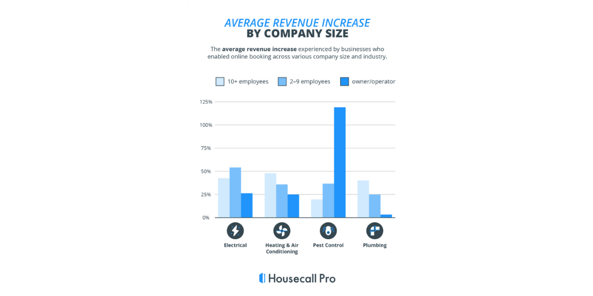
In fact, a recent study by Webflow suggests that local businesses who added an online booking system increased revenue by 120%
 (3).png?w=2000&fit=max&auto=format)
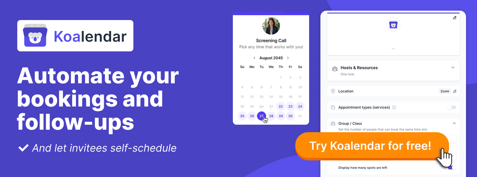
With Koalendar, you can:
- Embed the booking widget directly on your site
- Customize your service menu with durations
- Sync with your calendar to avoid double bookings
- Automate confirmations and reminders
Bonus: Handyman website design checklist
Here’s a quick checklist to make sure your handyman web design is conversion-ready:
✅ Clear headline and service offer
✅ “Book Now” CTA above the fold
✅ Online booking page (not just a contact form)
✅ High-quality service photos and descriptions
✅ Transparent pricing and durations
✅ Local SEO: Google Business Profile, service areas
✅ Reviews, badges, and testimonials
✅ Mobile-friendly design and fast loading
✅ FAQ section to reduce booking friction
✅ Simple navigation and clear footer
The fastest-to-implement web design trick to turn user into customers
A great handyman website isn’t just a place to showcase your work, done properly, it can help you book more of it, too. Adding a simple booking option turns your site into a 24/7 booking machine, letting customers take the next step right when they’re ready. No emails. No back-and-forth. Just smooth scheduling.
With a few small changes, you can:
- Build trust from the very first click
- Attract and qualify more leads automatically
- Save time on admin and focus on the jobs you love
- Turn your website into a steady source of new business
If you want to add booking functionality without hiring a developer, try Koalendar. It’s simple, professional, and designed to help solo handymen and small service businesses grow without extra hassle.
Ready to get more jobs? Create your free handyman booking page in minutes